Drawing
Walnut
Gives our own Kuwait software firm an identity that ships as pages, not PDFs.
- What it is
- Brand identity · Website
- Year
- 2026
- What we ran
- Drawing · Building
- Built with
- Vite · React · Tailwind · GSAP
- Live at
- www.walnutit.com ↗
The brief
Our own firm, and the hardest client to schedule. Walnut is an Odoo gold partner in Kuwait, unifying business operations, with an identity that was not carrying it.
Deliverables that are pages, not PDFs
Four of them, each a built application rather than an export:
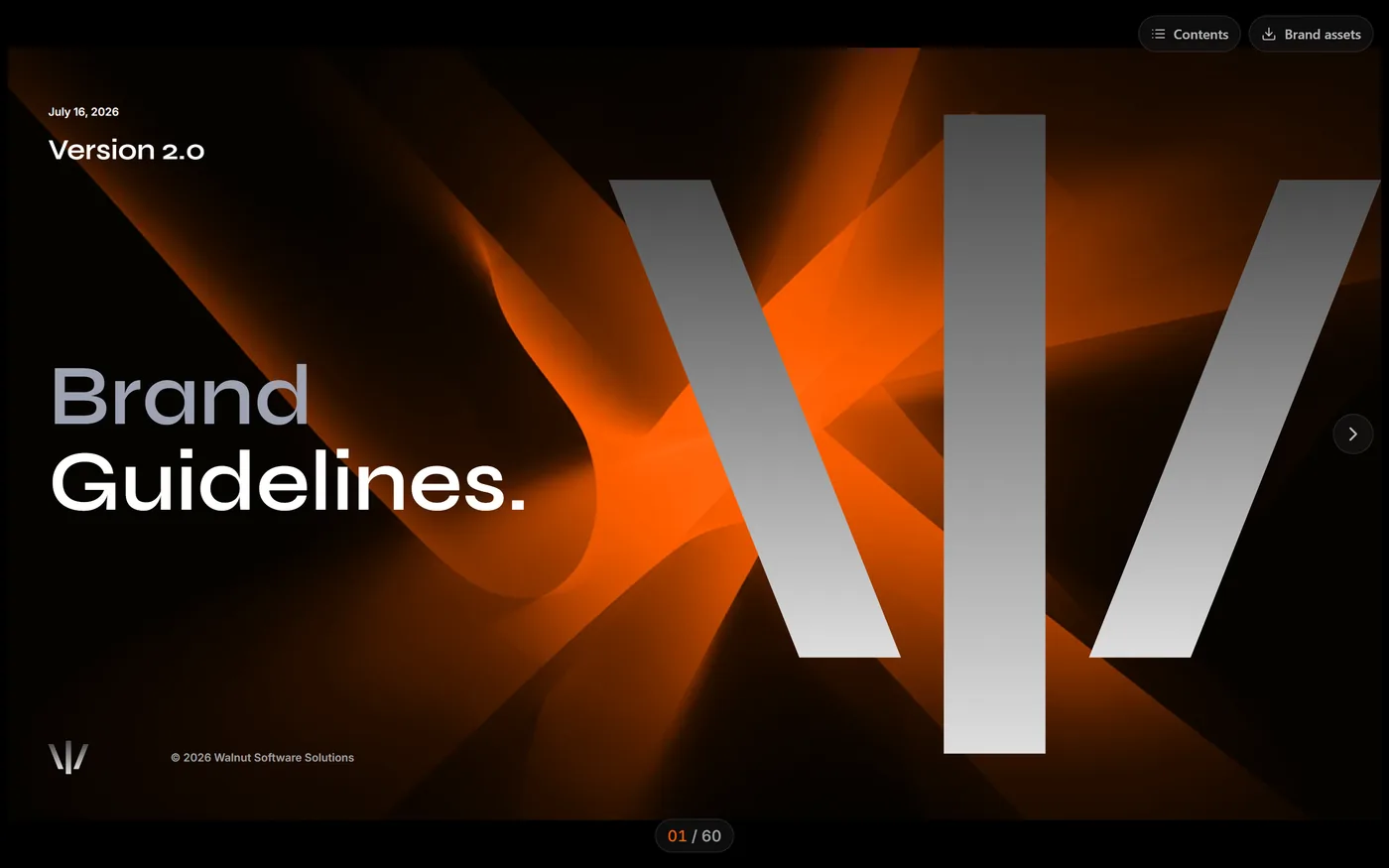
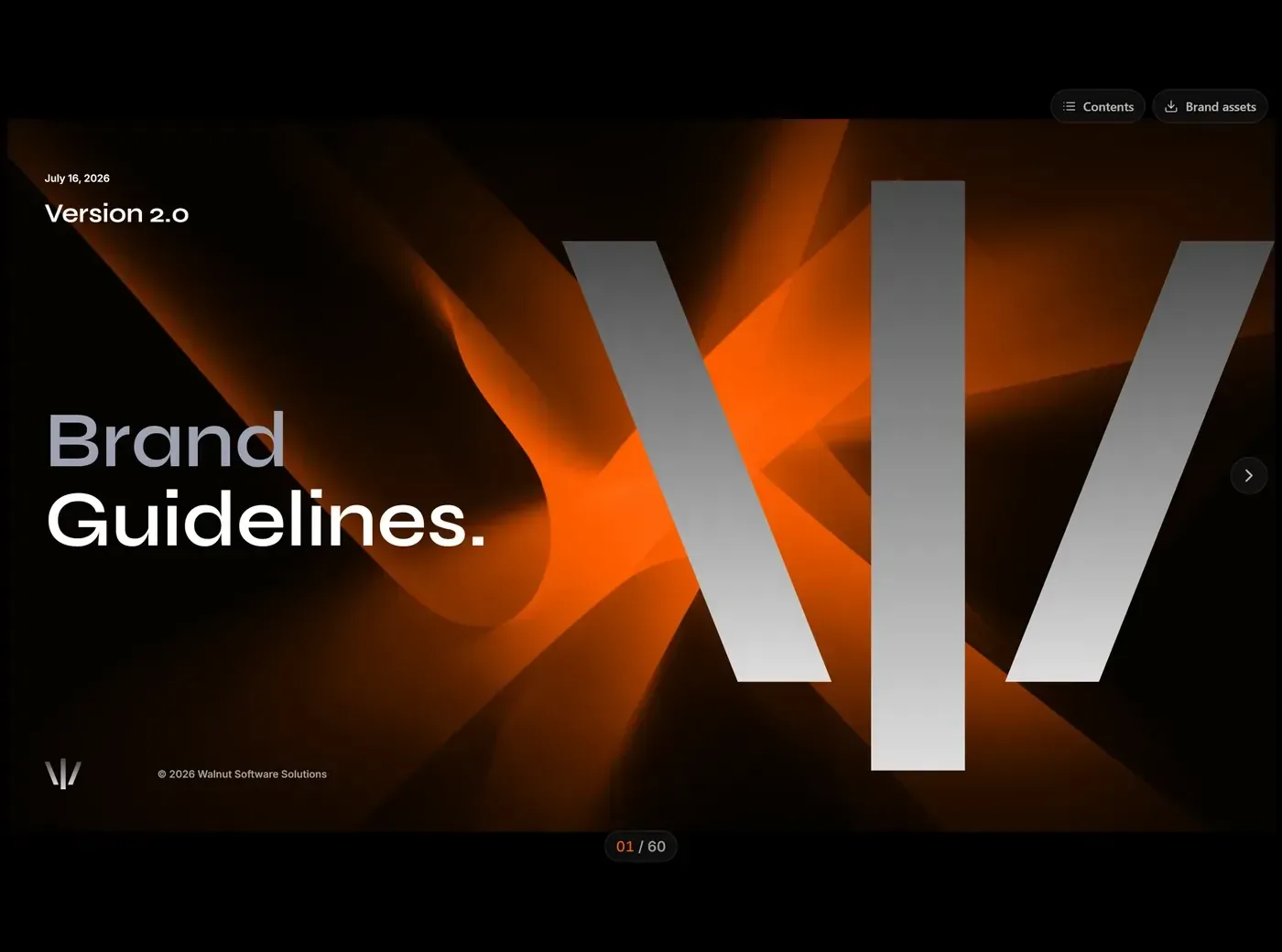
- Interactive brand guidelines, clicked through rather than scrolled
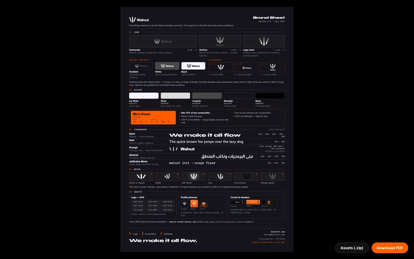
- A brand sheet, every rule and every downloadable asset on one screen
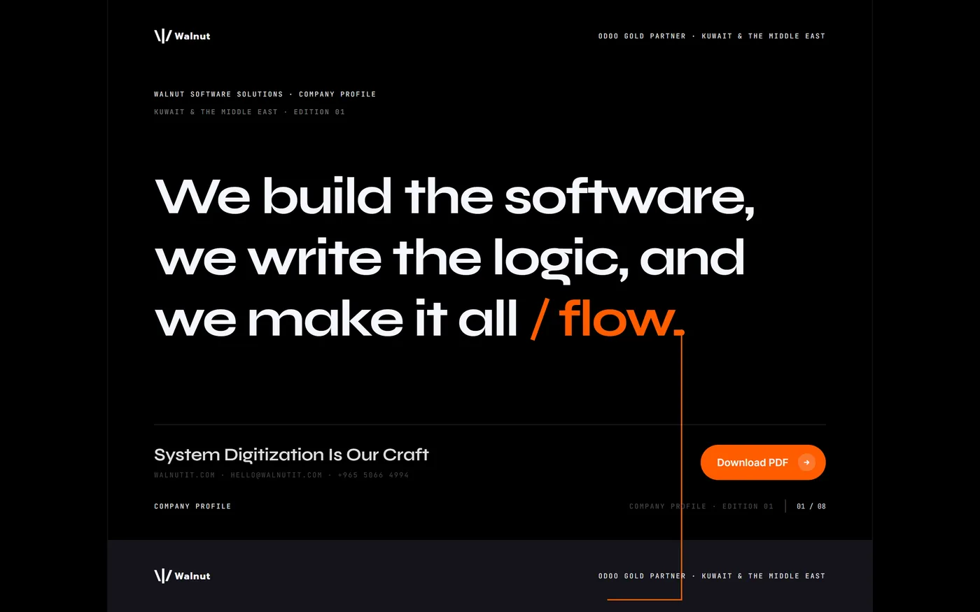
- A company profile that reads on screen and exports to print
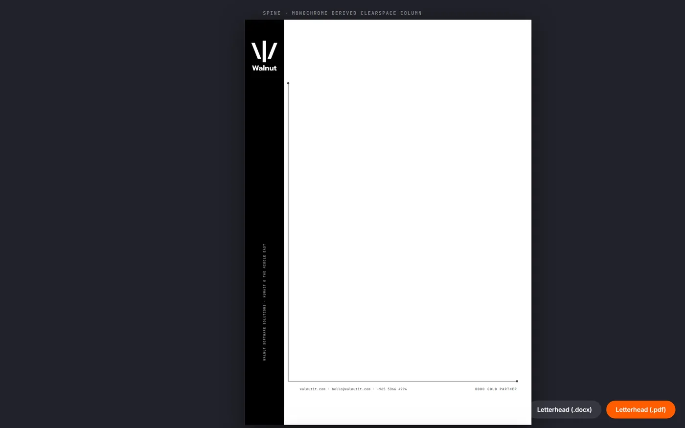
- Stationery, letterhead and two business-card treatments, print-ready
The reason is not novelty. A brand guide as a PDF starts drifting from the assets it describes the day it is issued, because the file and the artwork live in different places and only one of them gets updated. Here the page renders the asset it is documenting, so the two cannot disagree.
The site
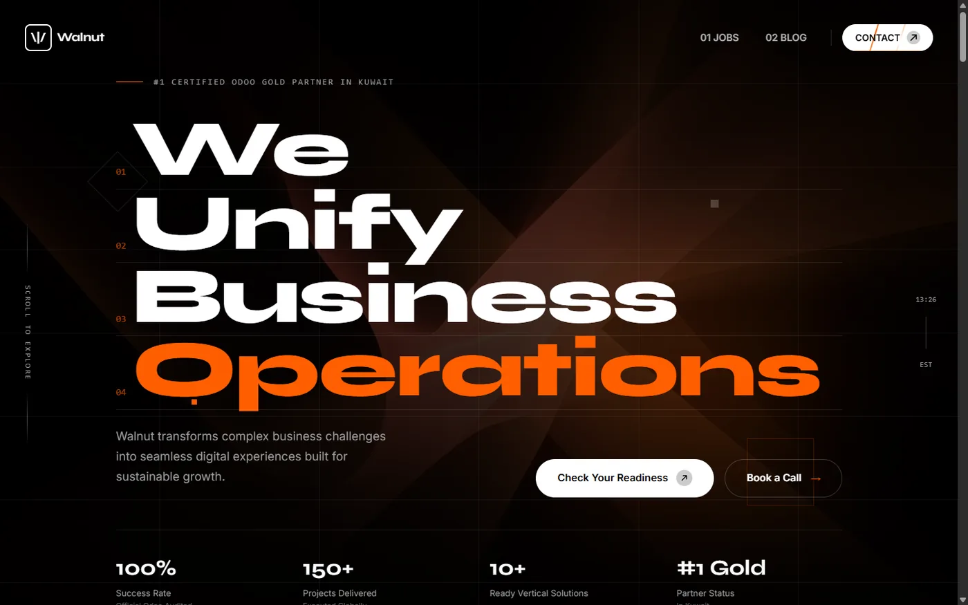
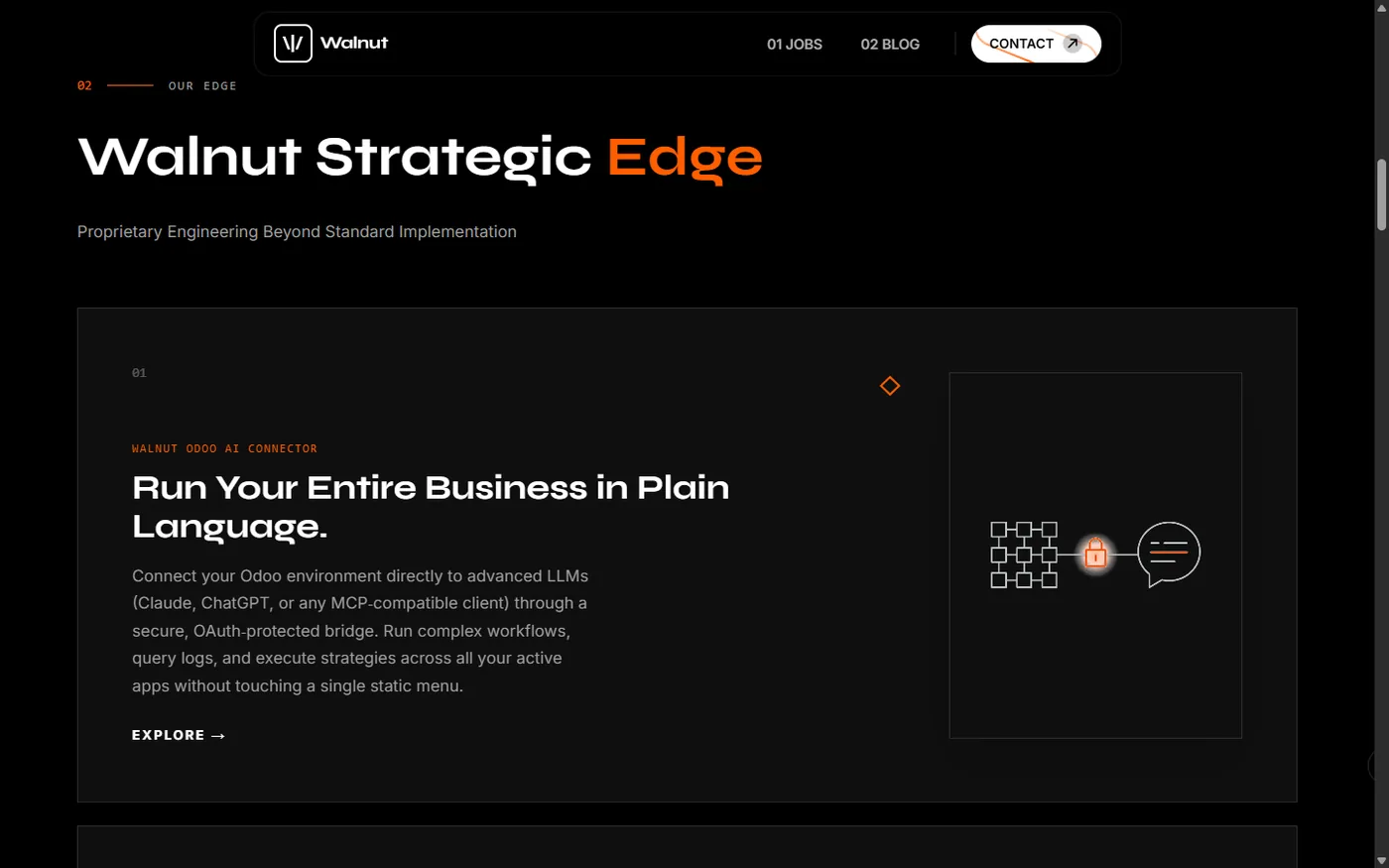
Heavy display type at full weight, a single accent used for emphasis and never for decoration, and a dark ground the type can carry. The stat row is the argument, and it sits where a visitor is still deciding whether to keep reading: success rate, projects delivered, ready verticals, partner status.