Building
Framed
Frames store screenshots at every size both stores demand. The least glamorous thing we run.
- What it is
- Internal tool
- Year
- 2026
- What we ran
- Building · Drawing
- Built with
- Next.js · React · Tailwind · shadcn/ui
Why it exists
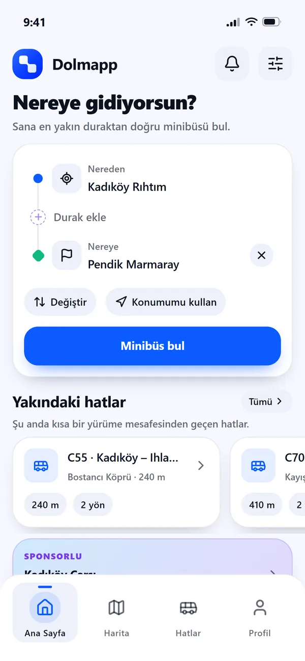
Dolmapp was finished and needed store screenshots. Both stores want several device sizes at exact pixel dimensions, in every locale you ship, laid out consistently. Getting that wrong means a rejected submission rather than a slightly worse page.
Doing it by hand in a design tool is an afternoon, every time anything changes. So we spent the afternoon once, on a tool.
What it does
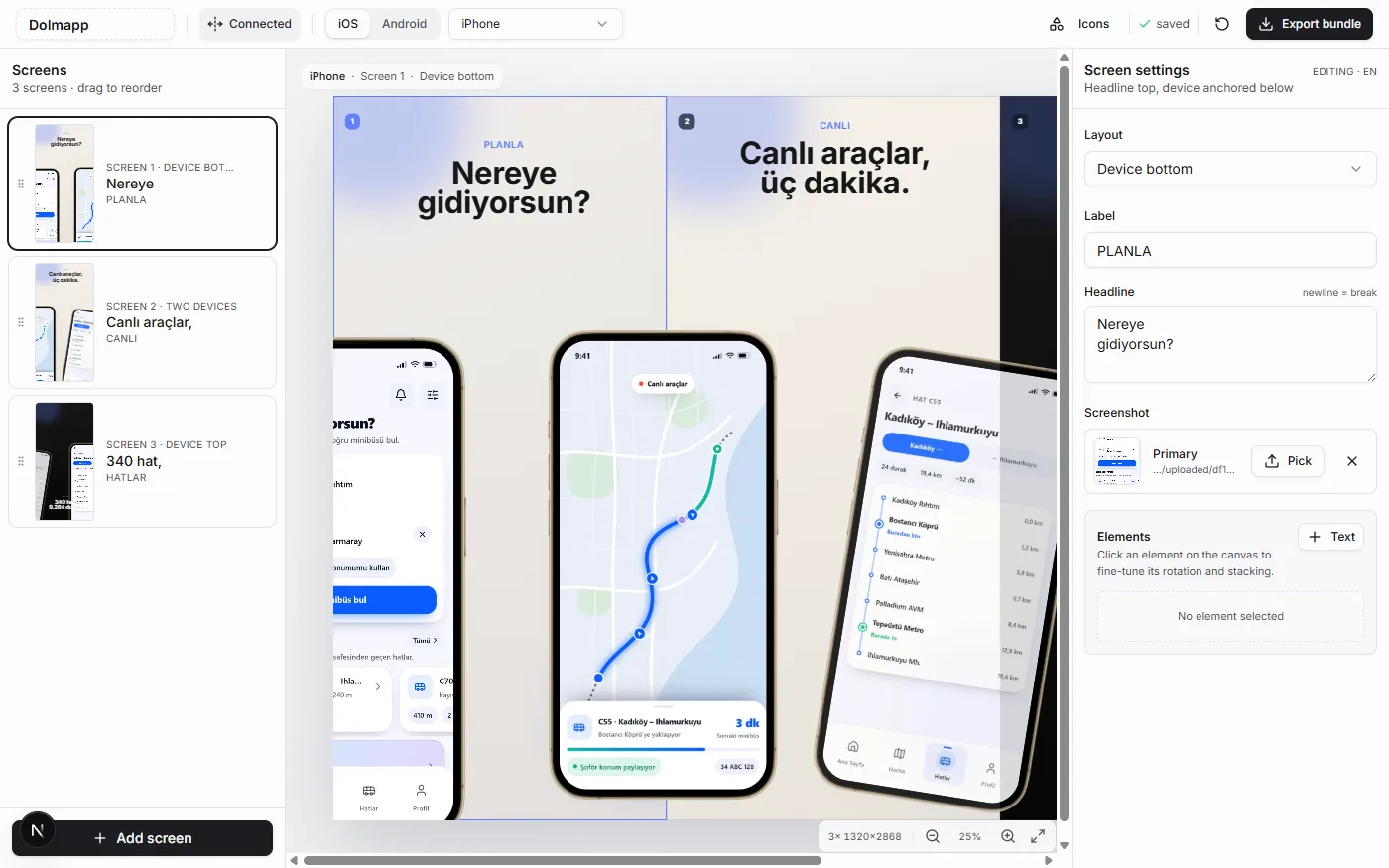
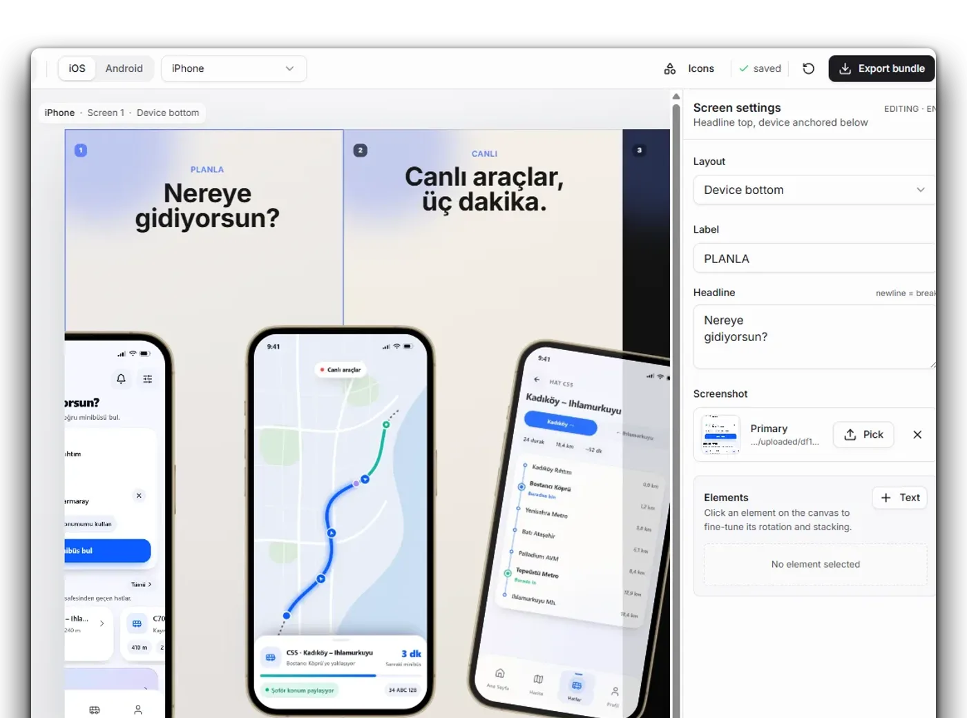
Upload your screenshots, drop them into a template, pick a device (iPhone 6.9", iPad 13", Android phone and tablet, or the Play feature graphic), style the slide, and export a zip organised by platform, device, dimensions and locale.
Device frames, backgrounds, captions and reusable templates, all at each store's exact required sizes. The layouts are per-slide, so a set can mix a single hero device with a two-up comparison without leaving the editor.
The point
It is the least glamorous thing here and the one we use most. Every app that ships needs this, nobody enjoys it, and the version that exists inside the studio means launch assets stop being the step that slips.